To view a larger image, click and move over to my flickr account. From there you can select "view all sizes."
I made some edits to the original post. Hopefully I can get some feedback from my ENORMOUS group of followers... giggle, giggle, laugh, laugh.
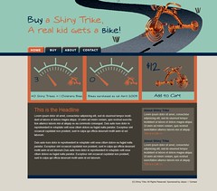
Overall the colors shifted slightly and more elements were added. Texture and a gradient overlay were also placed on the road. If you've got some feedback, I'd love to hear it! Thanks in advance!
Subscribe to:
Post Comments (Atom)


2 comments:
The blue headings against the light brown background in the right sidebar could be difficult to see....I'd have to see the site in action though. Otherwise, the page seems a bit dark (maybe), but again it could be just from looking at a small image rather than a full site.
I think that's a sweet design though. :)
I like the new additions Lynn. I think that the colors look good together and really like the bike- how did you do that? It would be great to see how it looks at the website. I think that the colors you've used will be easy to read. Nice work Lynn
Post a Comment